01. Overview
Background · Problem · Solution
Background
Photography and travel are two things that are becoming more viable with the modern age of technology and affordable transport. This has led us to places that, as individuals, we have most likely never travelled to before, and so we don't know the cool spots, hidden locations, and areas where photographers gatekeep.
Problem
Photographers, both at home and abroad, do not know where to shoot, and must spend days, sometimes even weeks, finding suitable locations to shoot at. This is amplified if travelling abroad. What if I could design an app which cuts down the work required to find suitable locations?
Solution
PhotoSpots is a community-driven mobile app that fills that gap — a dedicated platform to discover, save, and share shooting locations with exact conditions, tags, and accessibility info attached.
02. Research
User Interviews · Understanding Workarounds · User Flow
User Interviews
I used semi-structued interviews to build a domain model that accurately represents the different types of users and skill levels. To achieve this, I interviewed a mix of working professionals, hobbyists, and students.
Understandings Workarounds to Existing Solutions for Finding Locations
Users said that their current way to find locations consisted of Google Maps and Instagram. There were no real solutions or services to use, and people were having to stitch their own information together. I used both myself, the same way they described using them, to see the gap firsthand rather than take it secondhand.
Insights
After I completed my initial user research, I created an affinity map to categorise my data into themes. From there, I was able to draw insights, build two personas, and then identify opportunities and my design goal.
Insight #1
Multiple Discovery Modes Needed
Users need a way to discover when they don't know what they're looking for, a way to browse when they have an idea or a category, and a way to search for a spot they already know exists.
Insight #2
On-The-Go Discovery
Photographers are mostly looking while on the go (hence the mobile app and high discoverability with a full-bleed map on app launch).
Insight #3
Specific Categorisation
When users know the genre they are looking for, they are looking for specific types and categories.
Insight #4
Peer Validation
Users are relying on peer validation to understand the realistic scenario around a spot (so accessibility, what it "actually" looks like, not just a professional shot etc.).
Allowing All Types of Users to Navigate the Content
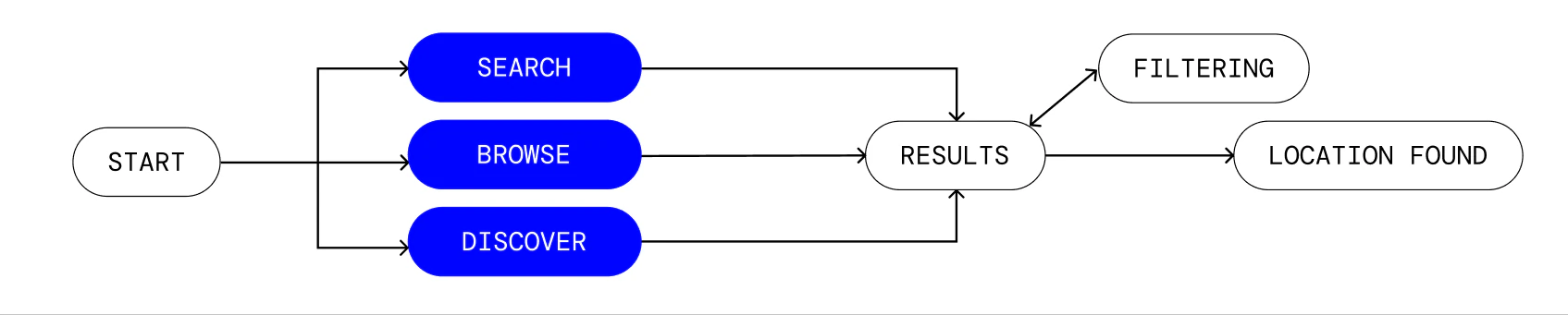
I mapped out the way users would navigate my information hierarchy. I found three distinct ways users would arrive at the same location from interviews and tree testing. This information architecture supported all 3 methods of finding a spot.
Opportunities & Requirements
Based on my findings, there were some product requirements which linked in with opportunities which fed into my design.
- There must be multiple ways for users to reach the same destination, through discovery, browsing, and searching.
- A peer review system where users can upload realistic images and rate the spot.
- Ways to narrow down categories to specific themes that will need to be identified through card sorting.
"How might we help photographers find locations that match a creative vision — without requiring them to already know what they're looking for?"
03. Design
Design Decisions
Decision #1
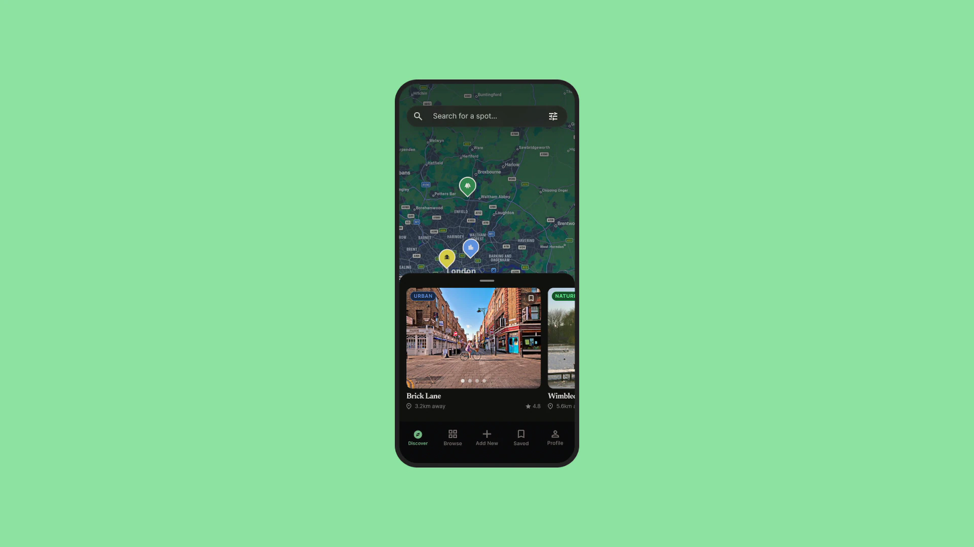
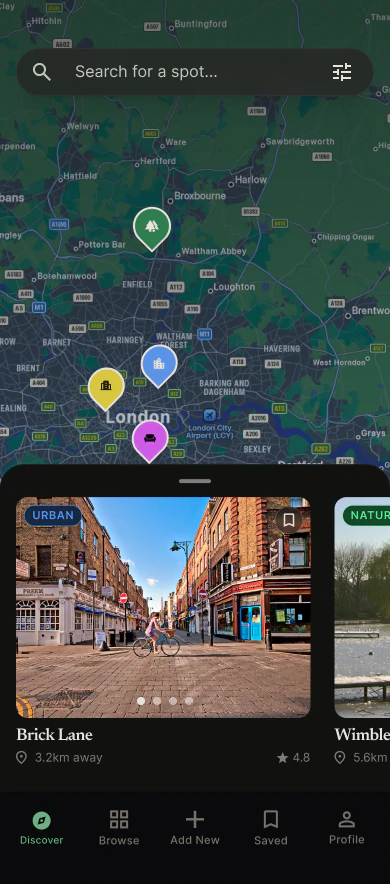
Allowing for Discoverability By Making a Full Bleed Map with Pins
Most participants went Nature → Lakes when asked to find a lake. A fair number skipped categories entirely and went straight to Discover — looking at the map before they knew what they wanted. The Discover screen is a full-bleed map with a draggable card tray at the bottom. Pins are colour-coded by category. Panning the map will reveal more pins. A classic search bar sits at the top if you already know where you're going. The browse tab shows the same locations in your area in a flat grid layout.
Decision #2
Interviews Said Sub-Types Matter, So I Conducted Card Sorts To Categorise The Content and Identify Correct Labels
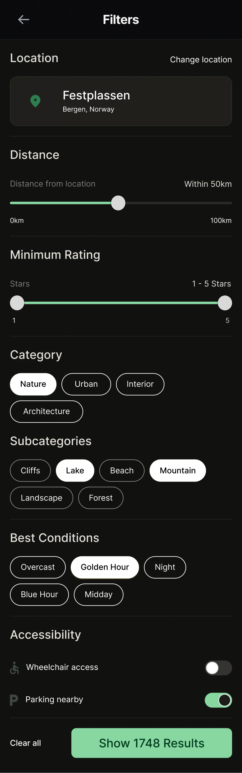
All the filtering is in a panel one tap away — category, subcategory, conditions, distance, rating, accessibility. The result count updates as you adjust your filters. The categories came from a card sort — they reflect how photographers actually thought about locations and their names.
Decision #3
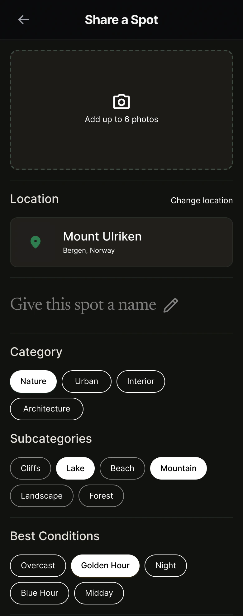
The Contribution Form Makes Thorough Tagging Easy
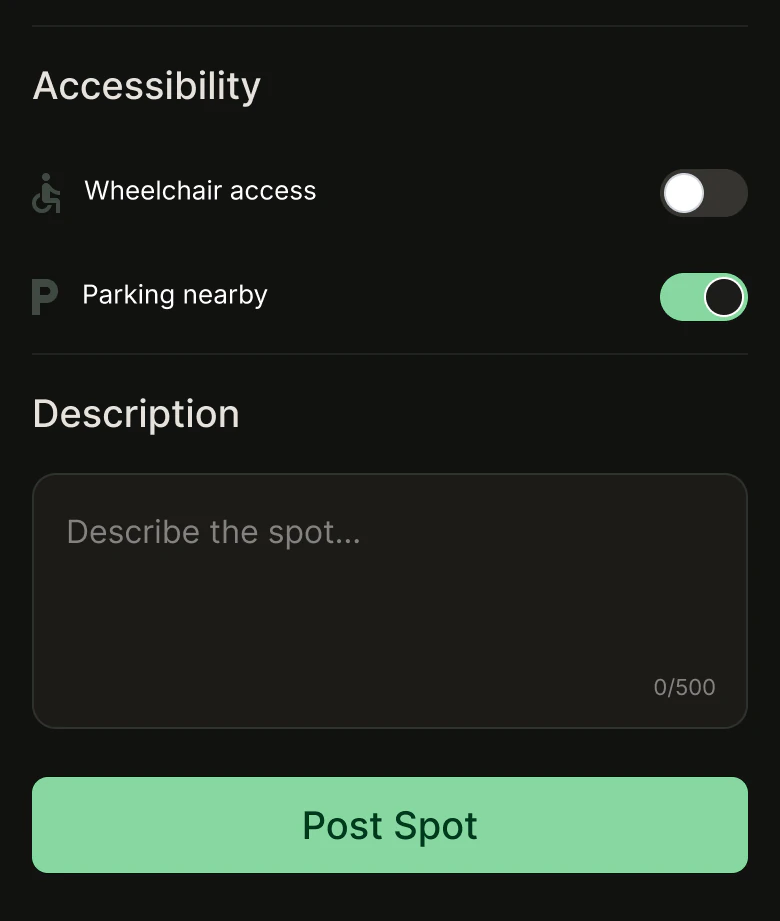
Initially, the user adds photos and location first. Category, subcategory, and best conditions follow as pill selections. Accessibility is two toggles: wheelchair access and parking nearby.
Decision #4
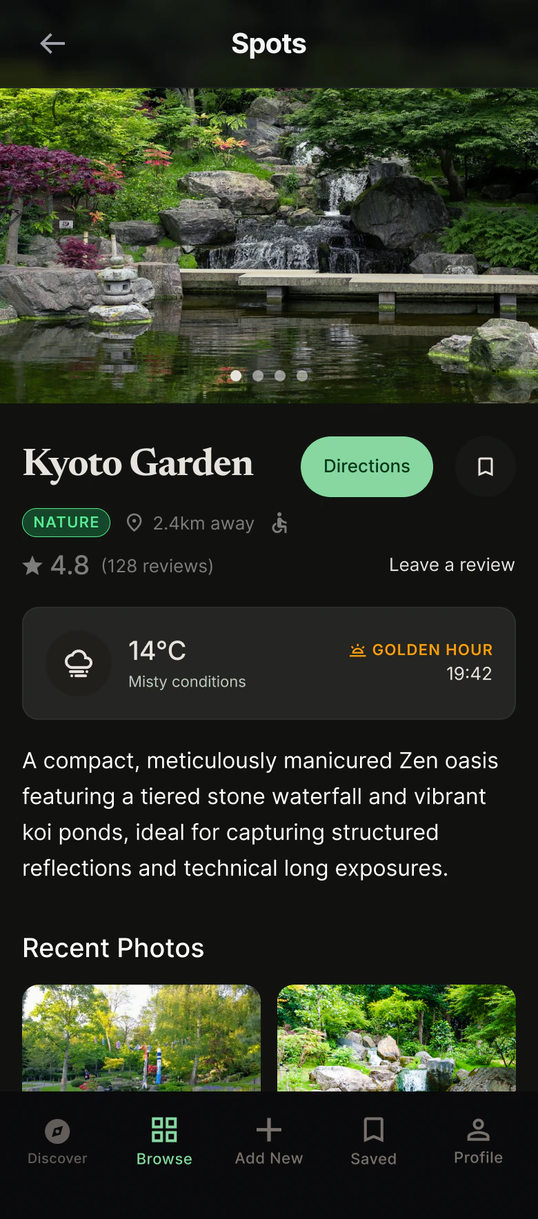
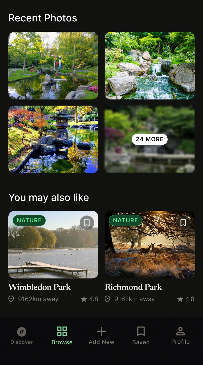
Every Location Gets Its Own Page — Conditions, Context, and Discovery in One Place
The location page is where the community data lives from the thorough tagging. A description, reference photos from other visitors, current weather alongside the optimal shooting window, and the conditions the spot is actually best suited for. Ratings and a save button sit below so users can shortlist without navigating back through the browse flow. These were all data points that were raised as useful during the user interviews.
Decision #5
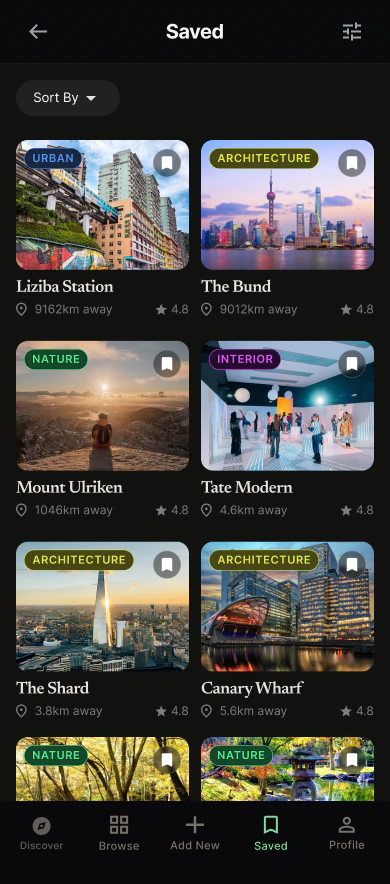
Easily Accessible Saved Locations
Once a user finds a spot they want to save to come back to for future reference, they can easily access the saved tab on the navigation bar. Users can filter the saved tab just like the browse tab, allowing them to narrow down specific spots.
04. Conclusion & Reflections
Next Steps · Reflection
Next Steps
Moderated testing on a high-fidelity prototype would come next. As it was outside the scope of the academic project, it was never conducted, but I would like to ensure the visual design is robust and easy to use, especially the pins on the discover map.
Reflection
Card sorting was genuinely surprising. The categories users landed on weren't the ones I'd have chosen — and that's the whole point. My instinct for what a label should be is shaped by how I think about photography, not how everyone else does. Doing the card sort properly meant the language in the app reflects real users, not just me.