Open Seat

A two-sided talent marketplace built to fix chaotic hiring workflows for sim racing teams by vetting candidates with verified data.

Open Seat Hero
Project TypeConcept
RoleIndependent User Researcher & Designer
TimelineJan 2026 – Mar 2026
Core SkillsResearch, Wireframing, Prototyping, Testing
ToolsFigma

01. Overview

Background · Problem · Solution

Background

Sim racing is primarily built around team events. However, there are no effective methods of putting together a team. For the bigger endurance events, you realistically need around four drivers. Currently, that takes weeks, and sometimes even months, to find the right fit for your team.

Problem

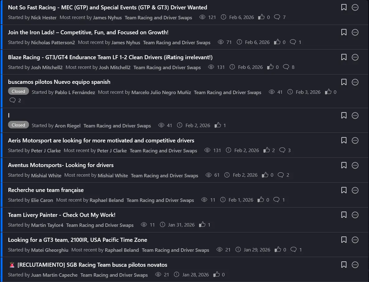
To find a driver for your team, you'd have to post on a forum and wait. Any reply meant scheduling a voice call just to collect basic info. A process that could live on a single web page was strung across weeks of DMs.Sim racing teams aren't organisations but are grassroot-esque teams born from a driver who took initiative.

Solution

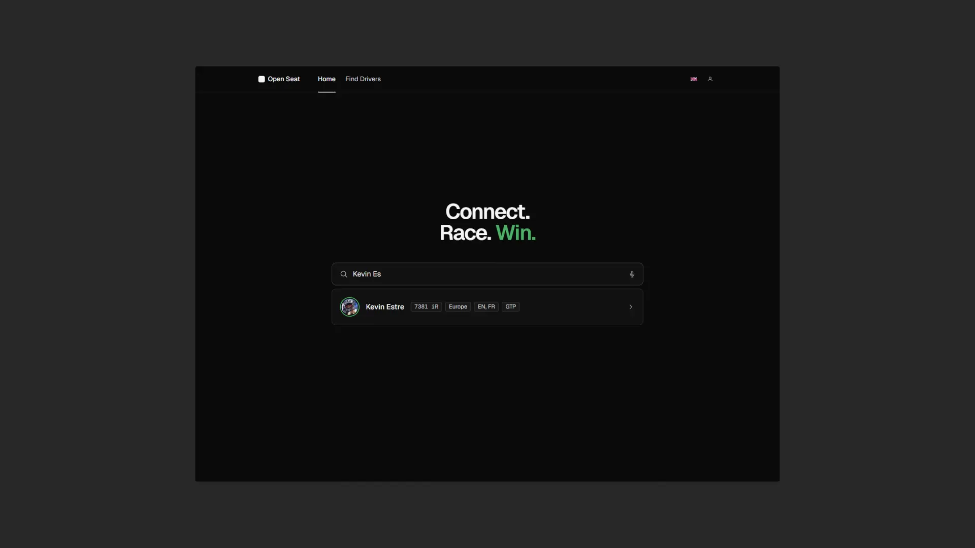
Open Seat is a dedicated recruitment platform for sim racing teams. It replaces the fragmented, informal process of forums posts and DMs with a structured directory where drivers connect their verified iRacing accounts. Managers search the pool, review actual stats alongside community endorsements, and reach out directly — turning weeks of vetting into a few clicks.

Driver List
Driver Profile

02. Research

User Interviews · Current Methods · Insights

User Interviews

I conducted semi-structured interviews with team managers and drivers who have been looking for seats in the past. I opted for semi-structured interviews as this topic is incredibly nuanced and not one-size-fits-all. This gave the participants freedom to speak about their experience.

Current Methods for Recruitment are Informal, Inefficient, and Drawn Out

When asked how they currently find drivers or seats, participants consistently pointed to the same two platforms: iRacing forums and Discord servers. I explored both to see the gap firsthand rather than take it secondhand.

iRacing Forums screenshot
iRacing Forums
Discord Server screenshot
Discord Servers

Insights

I used thematic analysis and inductive coding to code and identify themes from my user interviews and my notes from my findings of existing solutions. I also created an affinity map to identify more important details and group them accordingly. From this data, I was able to create a manager and driver persona.

Insight #1

Raw Data Alone Overwhelms

How information is organised matters as much as how complete it is — especially when two people are deciding whether to trust each other.

Insight #2

Soft Skills Matter as Much as Pace

Managers hire for reliability over raw speed. The platform needed a community endorsement layer that couldn't be self-authored.

Insight #3

iRating Alone Discounts Racing Style

Reducing a driver to a single number erases context. History and style need to be visible alongside peak lap time.

Insight #4

Reliability Is the #1 Hire Criterion

Across all participants, reliability was the unanimous top criterion. It needed to be a headline metric, not buried in race history tables.

Opportunities & Requirements

After my analysis, I identified some key opportunities for my design.

  1. A comprehensive filtering system to help narrow down drivers who fit your criteria.
  2. A method to convey the human side of the driver beyond simple numerical metrics.
  3. A way to highlight reliability across previous results to remove the anxiety around hiring a driver.
  4. Users must have a way to contact each other.

"How might we give users the confidence of a personal introduction for drivers they've never met — through verified data, not word-of-mouth?"

03. Design

Visual Design & Design System · Design Decisions · Lo-Fi Testing

Visual Design & Design System

I began my visual design thinking ahead. I built a library of icons, a small design system which I could easily change, add to, or swap elements from. I utilised the 8-point grid, auto-layout, and constraints to build a responsive design.

Building my final design using the components and design system in the beginning allowed me to make universal changes in one simple click. If I were to revisit this design, or build a new page, I could use my existing library easily.

Showing a few key parts of the design system
Decision #1

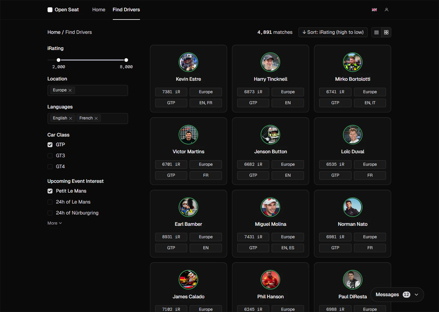
Grid and List Layouts To Assess Initial Fit

From the interviews, I found that users vet in two stages: initially, they eliminate based on raw numbers, then assess on human fit. The grid layout supports rapid scanning of non-negotiables — language, time zone, iRating, and car class. The list layout puts biography and human context first. The three-column cap came from what worked in testing.

Grid layout for rapid driver scanning
Grid layout
Decision #2

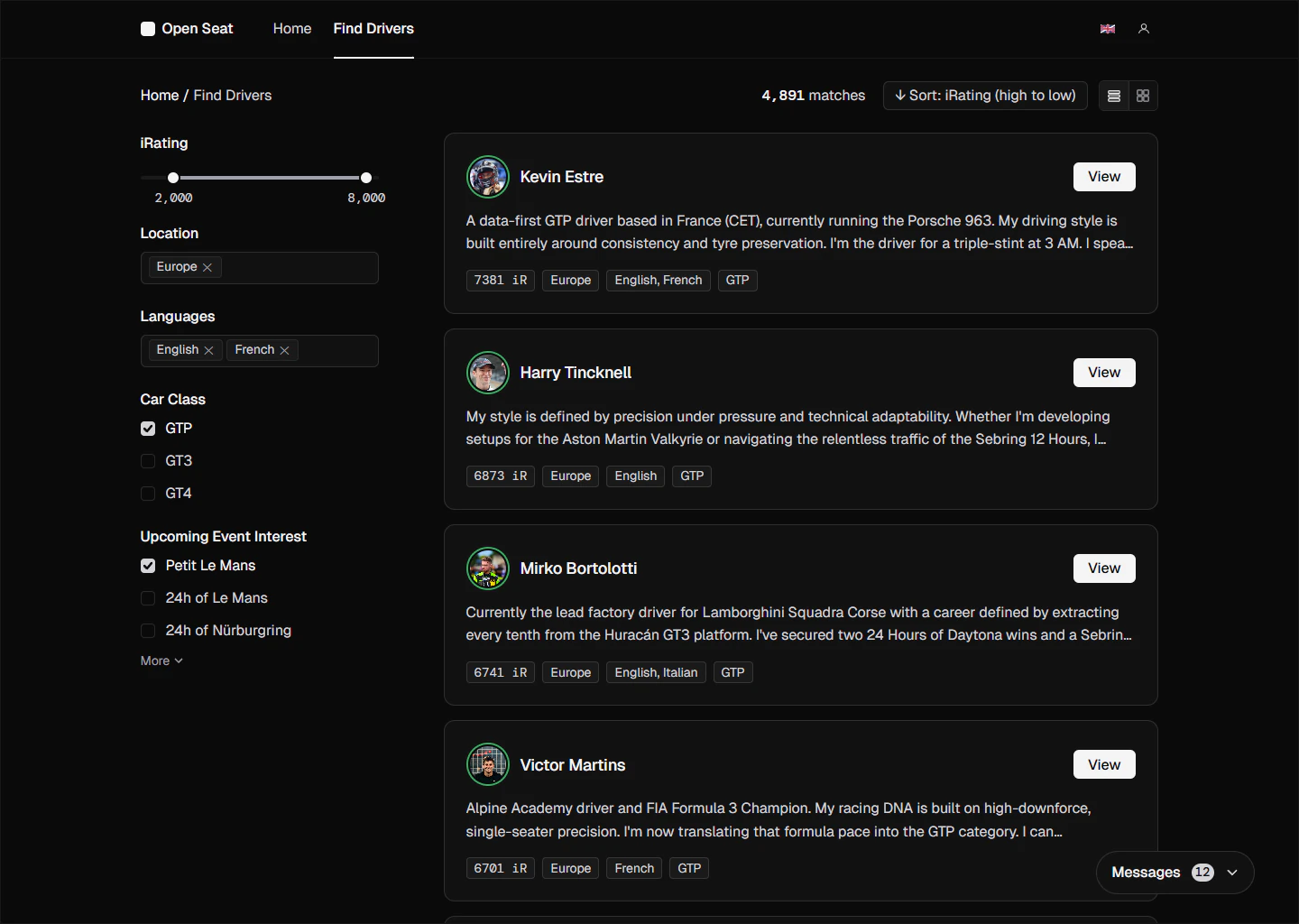
List View as Default — Slower, but Users Made Better and More Informed Decisions

Both layouts were tested with all five participants. The grid was faster — participants said they'd only use it for last-minute emergencies when any available driver beats a forfeit. For considered team building, the list took longer, but every participant felt more confident in their final choice after reading bios, before even opening a full profile.

List layout for bio-first evaluation
List layout
Decision #3

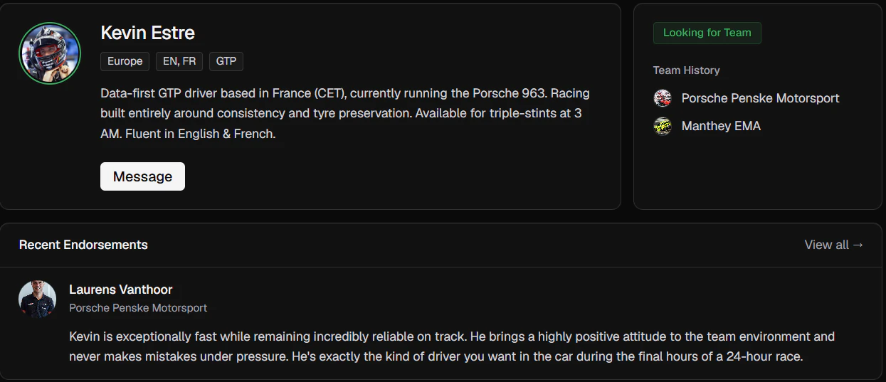
The Profile Layout Follows Manager Logic: Identity & Endorsements → Performance → Discovery

Interviews kept surfacing the same manager logic: who is this person, how have they performed, who else is worth a look. The profile follows that sequence — bio and endorsements first, performance data second, similar drivers last. Community-verified quotes appear above the fold before any numbers. The four metrics — Race Pace, Qualifying Pace, Consistency, Tyre Management — came directly from interviews. Those were what participants named when asked what separates a fast driver from a good teammate.

Driver profile page
Driver profile page identity layer
Decision #4

Reliability Gets Its Own Dashboard, Above Raw Pace

The dashboard combines iRating, average finish, safety rating, win rate, and incidents per corner. The focus is who you'd actually want as a teammate, which typically isn't a person who can post one fast lap but crash on every other.

Reliability dashboard
Critical data points — highlighted by real drivers during research
Decision #5

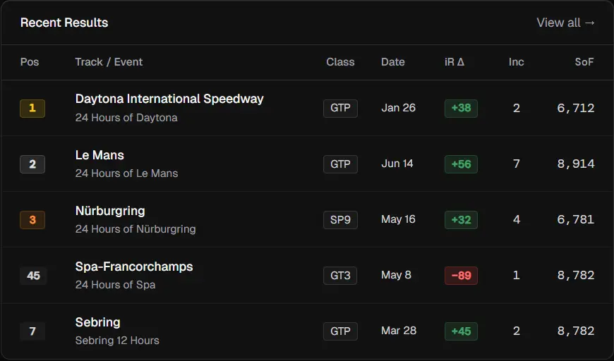
Strength of Field Score Adds Context to Every Race Result

iRating says nothing about the quality of competition a driver actually faced. Showing Strength of Field — the average iRating of all competitors — alongside every result gives each finish meaning. A hard-fought P5 in a high-SoF race ranks above a comfortable win against weak opposition, which directly addresses Insight #3.

Performance and reliability metrics
Results and core iRating contextualised by Strength of Field
Decision #6

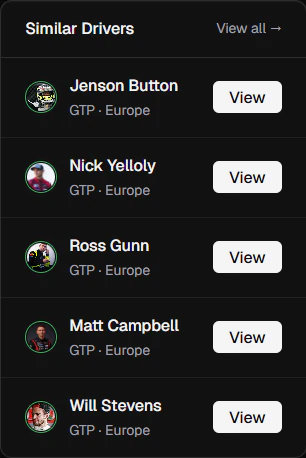
Promoting Discovery of Similar Drivers

I wasn't sure how many similar drivers to show, but in usability testing with five participants, five was the limit. They proved that instead of exploring, they scanned back and forth when the count was above five.

Similar drivers section
Decision #7

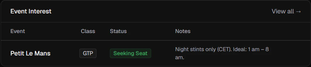
Driver Event Interest

Drivers can add their event interest at the bottom of their profile page — a quick reference for other drivers and managers checking requirements. By this point, unsuitable drivers have likely been filtered out during the search phase already, so this is more of a confirmation than a discovery tool. In testing, users responded well to the notes field, valuing how it let them pass on a driver without needing to message them first if non-negotiables were present in the notes.

Overview of event interest and relevant notes
Decision #8

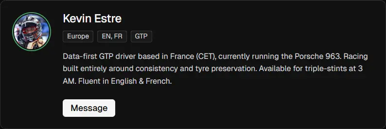
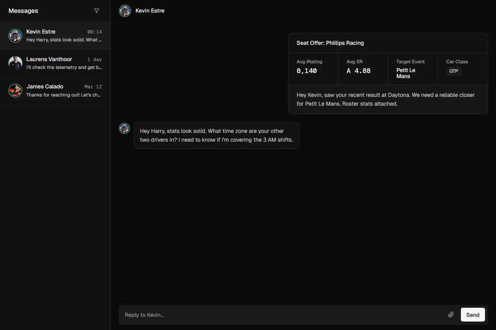
One-Click Seat Offer To Streamline Communication

Once a manager confirms a driver meets their criteria, messaging can optionally attach a Team Card with combined roster stats — a structured seat offer in a single click, replacing the usual chain of DMs and voice calls. Users can access chats and messages any time via the floating messaging tray at the bottom of any page.

Driver profile with messaging button
Driver bio and message handoff flow
Context-loaded chat interface
Platform-provided messaging service

Initial Scrapped Designs: Lo-Fi Testing

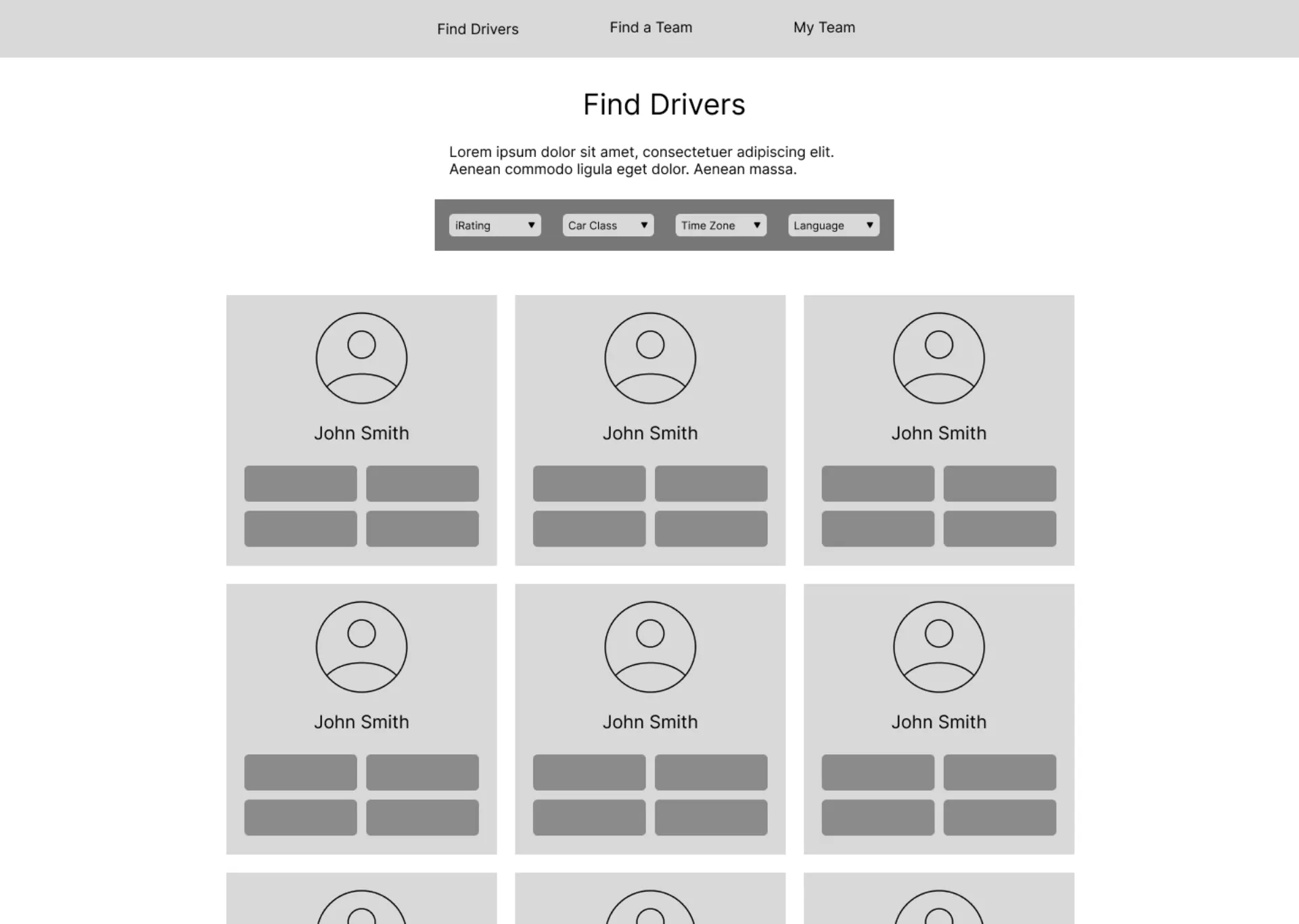
First, the filtering layout failed. A LinkedIn-style filter bar fixed to the top frustrated participants — they had to scroll back up to refine searches after scanning results. A sticky side panel updating results in real time fixed it.

Second, the grid-only layout hid the most important information. Participants had to open a profile just to read a bio — which led to the dual-view system, with list as the default and grid available for rapid scanning.

Lo-fi wireframe explorations for Open Seat
Initial lo-fi explorations — including the rejected top-filter layout

04. Conclusion & Reflections

Next Steps · Reflection

Next Steps: The Core UX Risk

Users might treat Open Seat as a search engine — find the driver, grab their Discord ID or iRacing user ID, and take the next steps elsewhere. Sim racing already runs on Discord, so there's no obvious reason to message someone on a platform that no one is really using.

Two options: ship the messaging system and see if it gets used, or drop it and surface 3rd party profile links directly — making Open Seat a discovery tool rather than a communication one.

Reflection

The original layout looked fine until real people used it. It became clear the whole filtering structure and grid style were wrong. Watching someone struggle with my design for five minutes taught me more than any amount of time making it look right without testing or insights.