01. Overview
Background · Problem · Solution
Background
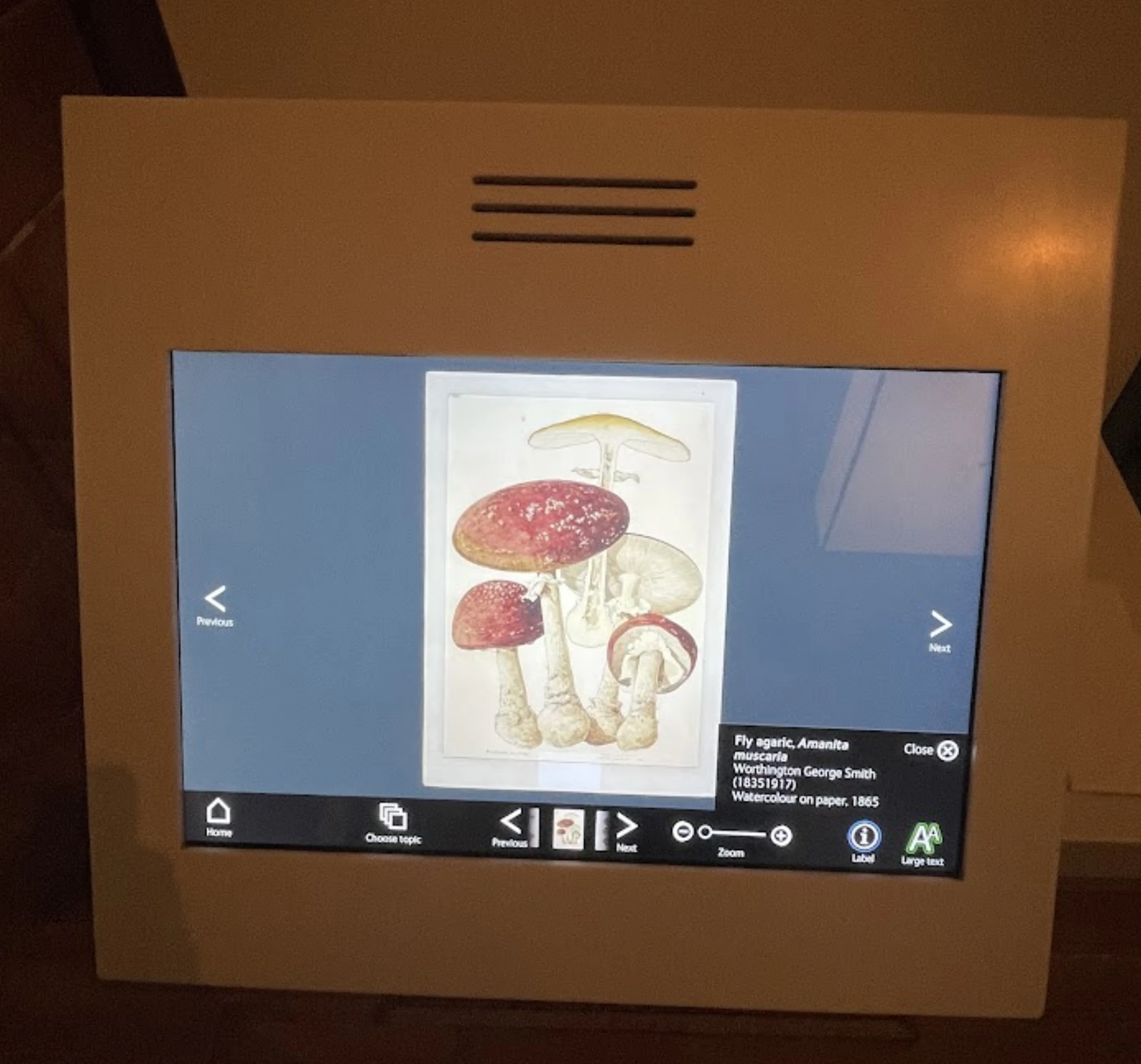
Current artefacts at the Natural History Museum are not engaging enough. Interaction levels are low, and early drop-off rates are high.
Problem
How can we improve the engagement rates at the museum while not taking away from the exhibits themselves?
Solution
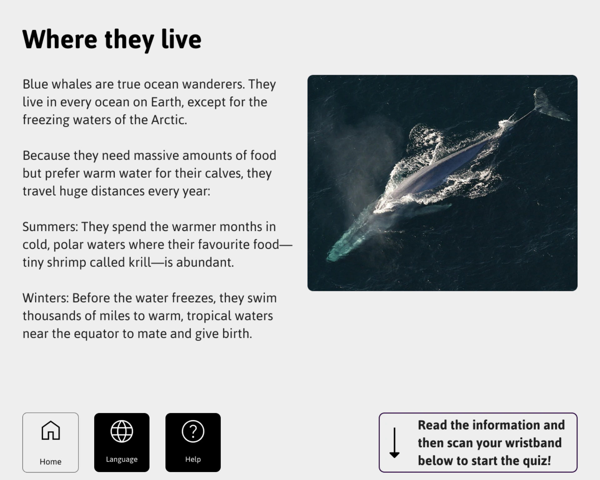
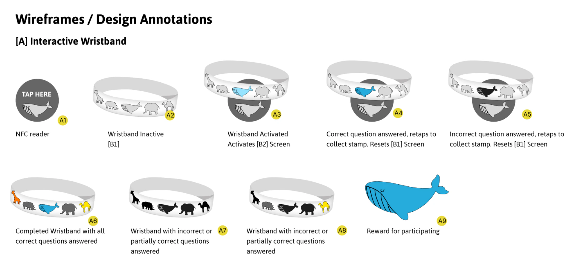
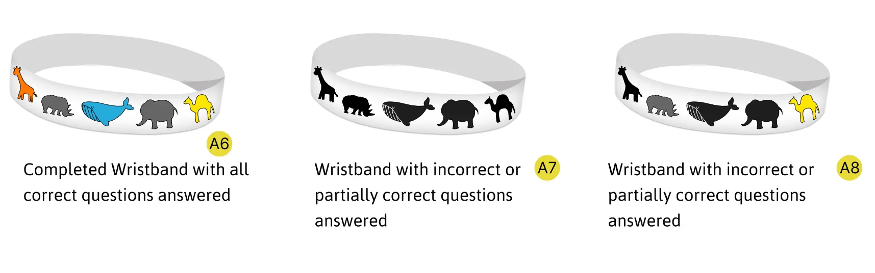
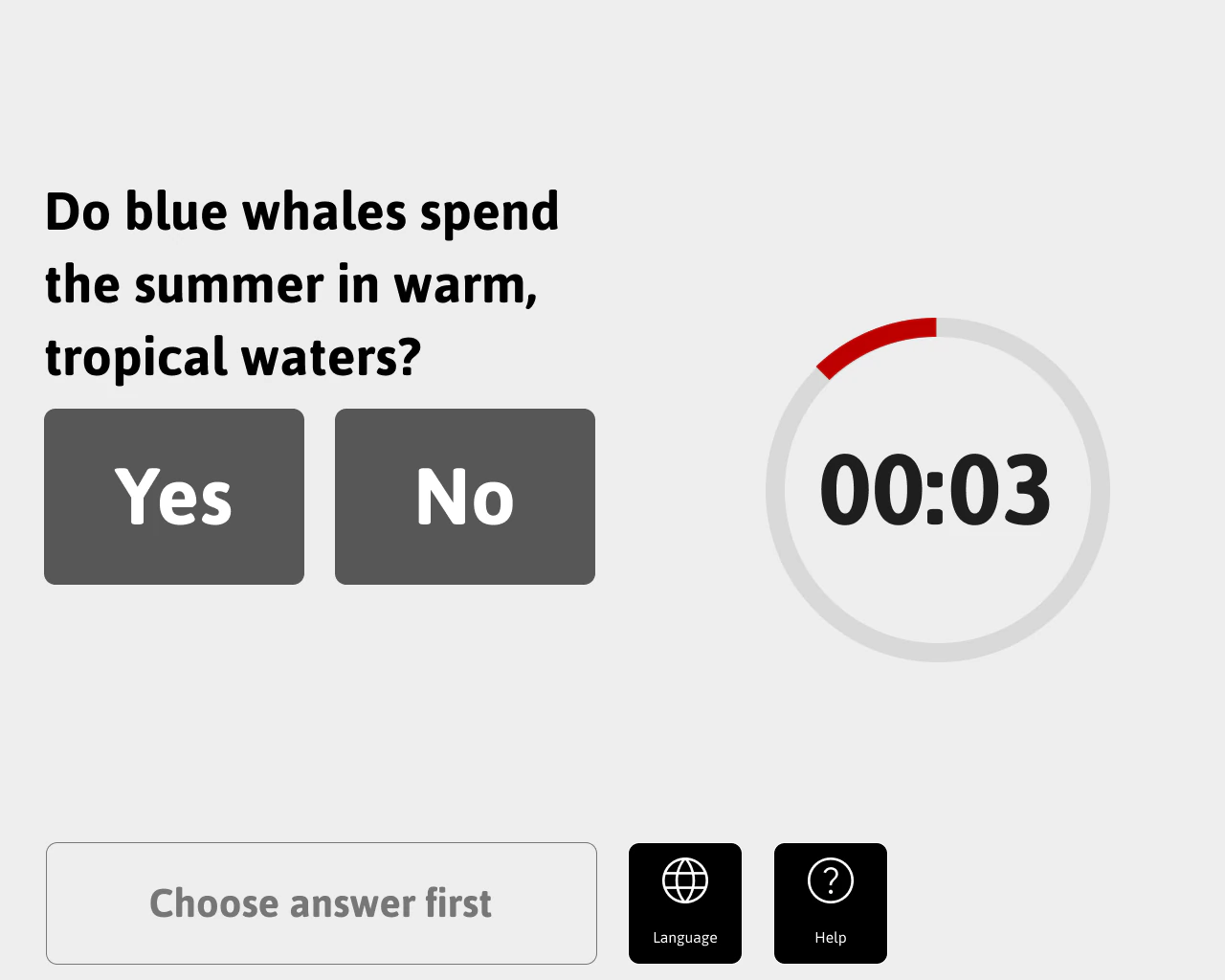
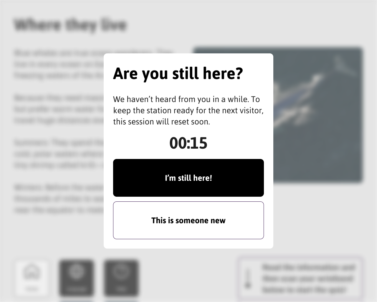
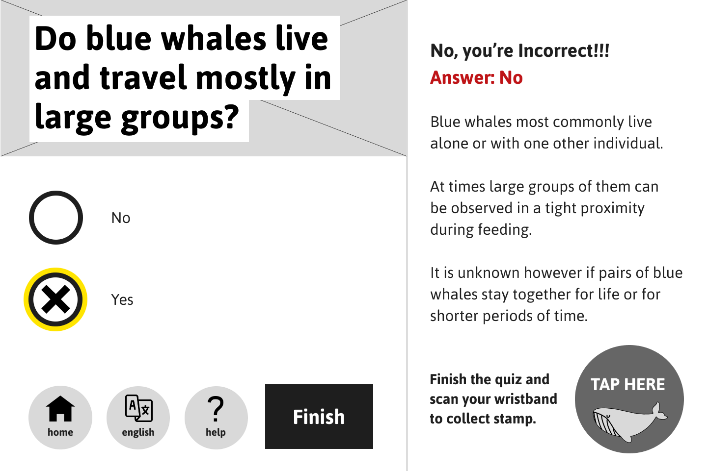
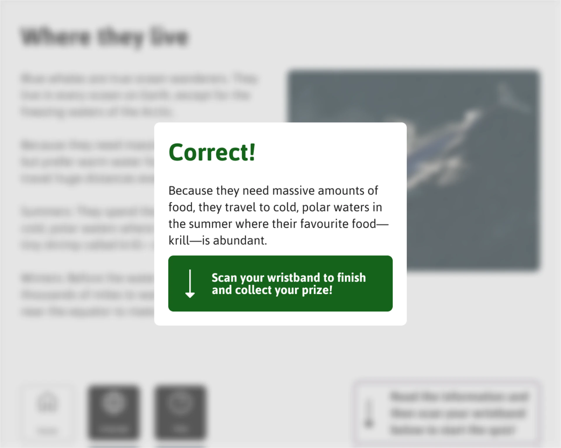
Our design was a kiosk where visitors read a short exhibit fact, tap their NFC wristband, and answer a quick quiz question, all within 90 seconds. If you answer correctly, you are rewarded, and the wristband logs a reward stamp to collect across the museum, which is exchanged for rewards as you leave. This created a fun, participatory way for visitors to engage with the museum, increasing interaction rates and reducing drop-off.